Sizing Up the Browser (Part 2)
Canvas Size
"To what size should I design my page?"
It's the eternal question. Since the time of Aristotle, the great debate has raged: How wide should
Web page content be?
We're not here to help you decide between 640-by-480-dpi and 800-by-600-dpi resolutions.
We're here to help you after you've made up your mind.
The table further down on this page shows the maximum canvas sizes you have
at your disposal for each resolution. These measurements were taken with the browsers in their
default states after installation � that is, with all those annoying toolbars showing. Remember
that many people aren't as smart as you are: They never turn those things off and are thus browsing
the Web through very small windows. In our tests the Microsoft Windows taskbar at the bottom of PC
screen was visible.
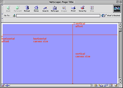
The horizontal size is what you can get with the browser window maximized on the screen. If the width gets
any bigger, you'll get an ugly horizontal scrollbar or your content won't be visible to users. The vertical size
measures the amout of space "above the fold" � that is, what users can see without scrolling down.
See the diagram below for the canvas size of an example browser at 640 by 480 dpi:

Click for full-sized image - The area in blue is the canvas.
Note that these canvas size measurements do not include the browser offsets we saw on the previous
page. In every major browser except Navigator 3.x, you can increase your canvas size slightly by eliminating
the offset buffer.
Let's look at the numbers....
| Browser |
640x480 width |
640x480 height |
800x600 width |
800x600 height |
| IE 5.x (Win) |
600 |
275 |
760 |
395 |
| NN 4.5+ (Win) |
604 |
294 |
764 |
414 |
| NN 4.0x (Win) |
604 |
294 |
764 |
414 |
| NN 4.5+ (Mac) |
592 |
309 |
752 |
429 |
| NN 4.0x (Mac) |
582 |
315 |
742 |
435 |
| IE 4.x (Win) |
600 |
275 |
760 |
395 |
| IE 4.5x (Mac) |
563 |
318 |
723 |
438 |
| IE 4.0x (Mac) |
574 |
321 |
734 |
441 |
| NN 3.x (Win) |
600 |
270 |
760 |
390 |
| NN 3.x (Mac) |
582 |
306 |
742 |
426 |
| IE 3.x (Win) |
613 |
276 |
763 |
396 |
| IE 3.x (Mac) |
598 |
317 |
758 |
437 |
Measurements in pixels
Here's a highly annoying complication: When Microsoft Office is installed
on a PC, the Office taskbar is automatically added to the right edge of the desktop. It's 43 pixels
wide, which makes the overall canvas width 43 pixels less than what is listed above. And a lot of
people have Microsoft Office. (By the way, if users move the Office taskbar from the
right edge of the screen to the bottom edge, it takes up 32 pixels of canvas height instead.)
Our conclusion: Ugh. It's not a pretty sight. There are lots of different numbers. It's not immediately
clear which width and height you should design pages for.
Our recommendations
After analyzing the numbers and taking the Office taskbar into account, we have a few recommendations
based on different scenarios.
| Scenario Designed For |
640x480 width |
640x480 height |
800x600 width |
800x600 height |
| All browsers, both platforms (with MS Office Taskbar) |
| |
557 |
270 |
717 |
390 |
| All browsers, both platforms (with MS Office Taskbar) -
ugly horizontal scrollbar showing or no right-hand offet in NN & IE |
| |
567 |
270 |
727 |
390 |
| All browsers, both platforms (no MS Office Taskbar) |
| |
563 |
270 |
723 |
390 |
| All browsers, both platforms (no MS Office Taskbar) -
ugly horizontal scrollbar showing or no right-hand offet in IE 4.5 |
| |
574 |
270 |
734 |
390 |
| 4.0+ browsers, PC platform (no MS Office Taskbar) |
| |
600 |
275 |
760 |
395 |
Measurements in pixels
Playing it safe with the first recommendation means a relatively small canvas,
but at least you'll be sure everyone can see your content!
Notes:
- Focusing on browser versions 4.0 and higher (with MS Office taskbar) doesn't gain anything
over designing for all versions.
- Focusing on all browser versions just on the Windows side doesn't gain anything either.
In summary, there are no easy answers about canvas size. But we hope that the recommendations above will
give you a place to start.
Photoshop mock-ups
When designing Web pages, we always do mock-ups in Photoshop. Design first, code later. What this
means is that our Photoshop mock-ups need to look exactly like what the pages will ultimately look like in
the browser. Well, because of browser inconsistencies, they'll never look exactly the same, but it's important
to get them as close as possible.
For that reason, we always include the browser "chrome" (the buttons, scrollbar, and other parts of the
browser software that frames the page) in the Photoshop mock-up. We thought we'd provide these
Photoshop files for download here:
|