Balanced Page Design
Web page design is largely a matter of balancing
the power of hypermedia Internet linkages against the ability to imbed graphics
and motion media within networked Web pages. Some home or menu pages function
more like the covers of books or magazines. The idea is to draw the user into
the material with a combination of text descriptions and interesting graphics
related to the subjects:
 Graphic has been reduced from the original size. www.apple.com
The most efficient designs for general (mostly
modem-based) Internet audiences tend to use careful layouts of text and links
with relatively small graphics. These pages load into viewers quickly, even
when accessed from 28.8 kbps modems over SLIP or PPP lines, yet these pages
still achieve a substantial graphic impact. This is razorfish's elegant but
minimal layout design for the Pace-Wildenstein Gallery:
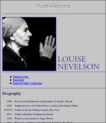 Graphic has been reduced from the original size. http://www.pacewildenstein.com
The screen is smaller than a printed page
While Web pages and conventional documents share many graphic, functional, and
editorial similarities, the computer screen is the primary delivery site for
web-based information, and the computer screen is very unlike the printed page.
Graphic designers often create page grids that look great on their extra-large
monitors, forgetting that most users cannot display more than about half of the
typical Web page at any one time, and only 10% of Web surfers ever scroll the page.
Width of page graphics
Computer screens are typically smaller than most books or magazines. A very
common mistake in Web design is spreading the horizontal width of your page
graphics beyond the area most viewers can fit on their 14-15 inches display
screens.
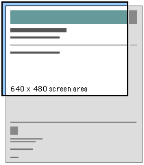
Graphic dimensions for web pages
Web page graphics should not be more than 535 pixels wide or more than about
320 pixels high, or the graphic will be too wide to print on letter size or A4
paper. Even when your readers have large display screens, the typical Netscape
or Internet Explorer window still defaults to a window width designed for
smaller monitors. Microsoft's otherwise excellent home page is too wide for
many standard office monitors:
 Graphic has been reduced from the original size. www.microsoft.com
The following size recommendations are based on
the typical dimension of a Web browser on a 14 inch or 15 inch Macintosh or
Windows 95 screen:
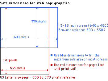
Design grids for HTML pages
A Web page can be almost any length, but you've only got about 30 square inches
at the top of your Web pages to capture the average reader, because that is all
they will see as your page loads. If all you offer is a big, slow-to-load
graphic, many casual readers will leave before they ever see the rest of your
Web site.
Consistency and predictability are essential attributes of any well-designed information
system, aiding users in identifying the origin and relationships of World Wide
Web pages, providing consistent and predictable access to interface and page
elements, and a consistent graphic design scheme. The design grids that
underlie most well-designed paper publications are no less necessary in
designing electronic documents and on-line publications, where the spatial
relationships between on-screen elements is constantly shifting in response to
user input and system activity.
Clown's pants
Current implementations of the Hypertext Markup Language (HTML) do not allow
the flexibility or control that graphic designers routinely expect from page
layout software or conventional multimedia authoring tools. However, the HTML
markup language can be used to create complex and highly functional information
systems if it is used carefully. When used inappropriately or inconsistently
the typographic controls and inlined graphics of World Wide Web (Web) pages may
result in a patchy, confusing jumble, without any apparent visual hierarchy of
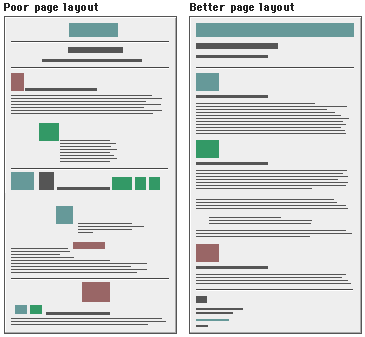
importance. This unfortunate "clown's pants" effect of haphazardly
mixed graphics and text results in decreased usability and legibility, just as
it does in paper pages. A carefully organized design grid that is consistently
implemented across a range of pages will aid your users in quickly finding the
information they want, and will increase the reader's confidence that they are
using a thoughtfully organized collection of information:
References
Hurlbutt, A. 1978. The grid. New York: Watson-Guptill.
White, J. V. 1988. Graphic design for the electronic age. New York: Watson-Guptill.
|