Intro to Filters
OK, you've created your own weblog and your hands are
shaking with excitement and terror. You just posted an
excellent new piece that details your grievances with that
jerk Kelly at work, an essay that is by turns insightful and
thrillingly alive with a kind of erotic frisson. But
where are your readers? Where are the hits? Why aren't
people falling over themselves to get at your sweet, sweet
words?
There are many possible explanations, but one is that
people are shallow, crass, and easily distracted by shiny
objects. If they come to your site and just see a page full
of text, their eyes will glaze over and they'll head right
on back to the Nude Animated GIFs site.
But, but, it's the content that's important, right?
Shouldn't your razor-sharp writing be enough to keep their
attention? Wouldn't dressing up the text with pretty
pictures almost be an insult? Isn't it what's in here
[gesturing toward heart] that matters most of all?
Yes, truly, but in the real world people like to see
their content all gussied up, preferably as sextastically as
possible. Sure, you can give them a few well-cropped and color-adjusted photos. But your blog
also needs its fair share of arty, distorted, eye-searing
pictures! And what about a zany logo?
Enter filters!
You may not be an artist ďż˝ so what if your talent lies in
crafting the written word? ďż˝ but I'm here to tell you that
while technology can't yet generate interesting writing
(check back in 2006 when Microsoft Grisham comes out of
beta), it can do a lot of artistic legwork for you. It's a
secret that Web designers have known for years: If you can
score a copy of the 800-pound behemoth known as
Adobe Photoshop, you can fake artistic ability with the
best of them.
Yes, Photoshop is expensive, and yes, it can have a
pretty steep learning curve. As for the first problem, let's
assume you can borrow a friend's copy, or perhaps pick up
the cheaper, more streamlined Photoshop Elements. As for the learning curve, the good
news is that we can safely ignore just about everything the
program has to offer except what lurks under the Filter
menu.
Sure, Photoshop can put your head on a bodybuilder's
torso or change a hideous pink sweater to a eye-bleeding
orange, but that involves reading the manual and rooting
around in the toolbar and palettes and the like. With
filters, all you have to do is choose an effect and see what
happens. They're all about trial-and-error and
learning-by-doing.
Filters got their name from the world of photography,
where you could change how a picture looked ďż˝ brighter,
redder, fuzzier, etc. ďż˝ by placing a filter over the lens.
Photoshop filters do the same thing, just with much more
variety and weirdness. The program comes with dozens of
built-in effects that can make your photograph look like
everything from a Seurat painting to a bad photocopy. And
once you get tired of those, you can pick up some
free ones or buy some from third-party companies like
Xaos
Tools,
Alien
Skin, or
Flaming Pear.
So fire up Photoshop, open up any image, and then start
making your way down the Filter menu. Pick one and watch the
dark magic unfold. Some filters (the ones with "..." after
their names in the menu) will pop-up a dialogue box before
working. Just hit OK to see the default action, or drag the
sliders around and see how tweakable everything is. Most
filters have a preview window to give you an idea of how
messed-up your picture is about to become. Nine times out of
ten I have no clue what a particular variable means, but I
can mess around with it and see the results, so from then on
I know what to expect.
Now that you've got the gist of filters, let's take a
look at a few examples.
Let's say I have a blog on Tripod that's all about me,
my thoughts on life, the pretend conversations I have with
my cats, and sonnets about my enchanted experiences at the
Renaissance Faire. Keep in mind that this is purely
hypothetical. I update my blog with seven or eight
thousand words a day, but would like to break things up a
little with some nice pictures.
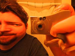
So I do what any self-respecting weblog author would and
take a photo of myself in the bathroom mirror. That way
people can put a face to the name, which can simplify
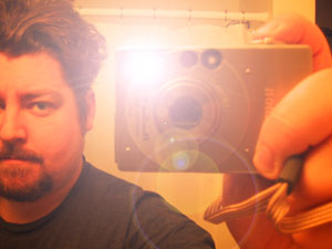
matters when filing for a restraining order. The snapshot
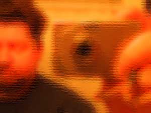
ends up looking more like an ad for the camera:
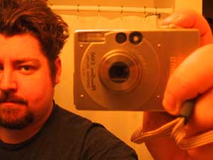
Plain-old unfiltered snapshot.
Let's take it to the next level. The most popular use for
Photoshop filters is tricking people into thinking you have
artistic abilities. So I go to the Filter menu and right up
top is a collection of filters filed under Artistic. Yes, I
would like to be artistic. I laugh at the suckers who went
to art school and click on Watercolor.
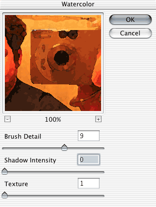
The Watercolor Palette in action.
Up pops a box that shows a preview of my photo under the
influence of the Watercolor filter. (Note: If you can't see
the entire picture in the preview window, you can click on
it and drag it around to see other parts.) Below are some
sliders that let me fine-tune it: Brush Detail, Shadow
Intensity, and Texture. What does Brush Detail mean? Who
knows ďż˝ let's slide it around. Looks like the lower the
detail, the blockier and faker my picture gets. So I crank
that up to 9, and turn the Shadow Intensity to 0 so it's not
too dark. In this example, the lower the Texture setting,
the smoother it looks, so I set that to 1. Then I hit OK to
see what it looks like.
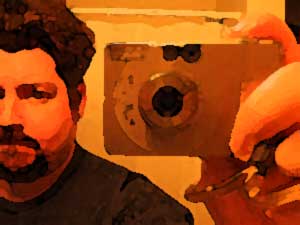
Hey, Mom! I do have talent after all! Look at this
watercolor I painted!
OK, Mom isn't buying it. You'll never understand my
art, Mother!!! Maybe she'll be more convinced by a
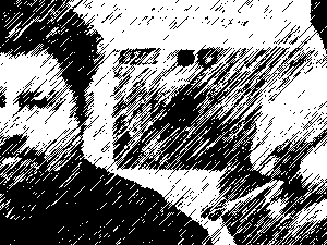
sketch. I head on down to the Sketch sub-menu and choose
Chalk & Charcoal. Again, three sliders to adjust how it
looks. Charcoal Area and Chalk Area let you balance how much
of each drawing tool you use, and Stroke Pressure lets you
control how many sketch-strokes appear. Did I learn this in
the manual? Oh no way. I just messed around with them
to see what they did. Here's what I ended up with:
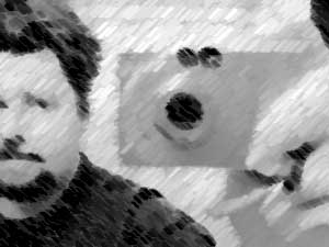
I just sketched this up at the local cafe! [Winkie!]
My skills are growing exponentially. I slap that on my
weblog, write "Untitled Self-Portrait [24 x 18", chalk &
charcoal]" underneath it and pass it off as my own
handiwork. My site is getting more visually interesting and
now the galleries are calling. So I crank out some more fake
art using four of the other filter faves:
The Underpainting filter.
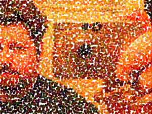
The Pointillize filter.
The Graphic Pen filter.
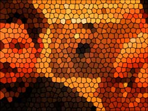
The Stained Glass filter.
But there's more to filters than duping people. They can
also be instruments of Boundless Good and Wretched Evil, as
you'll see.
Aside from art-simulating filters, there are also what I
like to call Actually Useful filters and Beautiful Eyesore
filters. In the first category is a set of tools that are
relatively subtle and can vastly improve your pictures, if
used with care. They can be found under opposing headers:
Blur and Sharpen.
Blur filters soften the focus of your picture, while
Sharpen filters make it clearer. If you don't want to mess
around with sliders and settings, just choose Blur or Blur
More (or Sharpen or Sharpen More), which apply a subtle
version of the filter. If you want to have more control
over, crank up Gaussian Blur or Unsharp Mask, two of the
most widely used Photoshop filters.
I often use these Actually Useful filters in conjunction
with other filters. For example, Watercolor could cause some
jagged edges in a picture and ruin the illusion of authentic
paint-on-canvas. Blurring the picture slightly can smooth
out those edges.
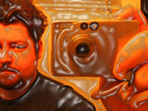
Or you can pretend you're a better photographer than you
really are by selecting a portion of your picture and
blurring it out, as if you'd carefully adjusted the focus
when snapping the photo:

(This does, however, require a quick trip to the toolbar.
I used the lasso and sloppily drew a line around everything
except the camera, thereby selecting it. I then blurred the
background with Gaussian Blur.)
At the other end of the spectrum are the Beautiful
Eyesores. These filters are all about messing up your
picture quickly and efficiently, and have been responsible
for some of the most astonishingly awful website designs
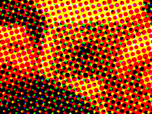
ever. Gaze upon the retro headache of Color Halftone:
...or the eerie wonder of Plastic Wrap:
...or the funhouse mirror of Pinch:
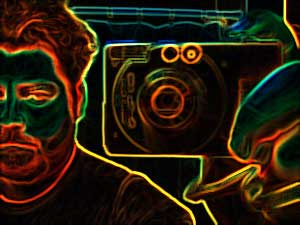
...or the disco fever of Glowing Edges:
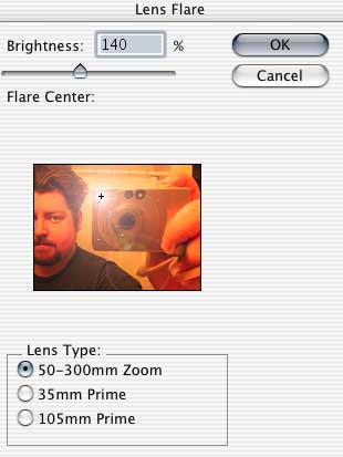
...or the infamous Lens Flare:
These are but a small sample. Dig deep into the Filter
menu and push those sliders to the extreme to really see
what horrors Photoshop is capable of inflicting.
But even Beautiful Eyesores can have palatable results.
Let's try throwing them at something other than a
photograph.
Up till now we've been working with photographs which
are, of course, Photoshop's favorite thing. But what if I
wanted to make a logo that featured the title of my site?
Let's say ďż˝ again, hypothetically ďż˝ that my weblog
is called "Josh's House of Stank." I type the title into
Photoshop and give it a blue background. (This calls for
another brief trip to the toolbar to use the Type and Paint
Bucket tools.) Like so:

Fine enough, but boring. What happens if we throw some
filters at it? Let's give ye olde Pinch another shot:

Not bad! Or maybe the aforementioned Glowing Edges:

Weird! Encouraged, I try some new ones, like Radial Blur,
Mosaic Tiles, Emboss, or Extrude:


As always, just choose some at random and play around
with their options. Photoshop filters are extremely powerful
and any one of them, even the most egregious Eyesore, can do
something great if applied to the right subject and tweaked
in the right direction.
So play around with them for a while and before long
you'll have something intriguing enough to catch a visitor's
eye. Then they'll be hooked, and will finally read your
words, and after that ... it's all over. You will own
them.
|