Type Face Terms Explained (Part 1)
A type face may be named for its original designer (Baskerville, Bodoni, Garamond,
Goudy); for its use (Times Roman was designed for the London Times; Century and Avant Garde were
designed for Century and Avant Garde magazines); for its characteristics (Excelsior and
Paragon were designed for high legibility); or for its designer's fancy (Perpetua, Souvenir, Centaur).
Type faces are also given generic names as well as brand
names, e.g. different type-founder's call Times Roman different names, e.g.
Times New Roman, Geneva, and English. Type founders' versions of the same type face
differ only slightly from each other. Even so you can, for example, seldom
interchange one type founder's 10-pt Baskerville with another's, to try to do so
would result in a noticeable mis-match with the original setting.
To identify type or recognize a wrong font, you
must know what the variables are, because differences amongst the thousands of
type faces available today can be minute. Since an untrained eye cannot distinguish
even gross differences, you should become familiar with the fundamental
features of type that are labeled in the following diagram:

Basic Anatomy of Type
x-height The height of the lower case letters such as `x', `a', `e'.
Ascender The stroke of a letter which rises above the Mean line as `k', `l', `h'.
Descender The stroke of a letter which hangs below the Base line such as `p', `y', `g'.
Mean line The imaginary line which determines the height of lowercase letters; ascenders rise above the mean line.
Base line The imaginary line on which all characters rest; descenders hang below the base line.
Body size Size of the type being used; measured from the end of the ascender to the end of the descender.
Serif Small strokes and cross-lines at the ends of major lines.
Set width Width, in units, allowed for each letter which varies between letters and type faces.
Cap Line The height of capital letters. Depending on type design, capitals may be taller/shorter or same height as ascenders.
Type Categories
All type faces that are to be used in the appropriate print media must be
purchased under a number of specific criteria. It is important to know whether
a favored type design has the necessary flexibility to be used for a wide
range of design and publication needs.
To this end, you must be aware that not all type
faces that are used have the same number of variations, or for that matter are
available on the output device that you wish to use.
Font
Many of the more popular type faces used today are available in three different
alternatives: Commercial font, Expert font and Pi font.
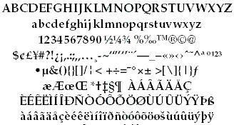
A Commercial type font contains the usual range of
characters that are needed for most forms of typesetting, i.e. one complete
assortment of alphabet letters comprised of capitals and lower case, numerals,
punctuation, special characters, and symbols.
A type font is only available in one specific
type face design. Therefore, a type face such as 10-pt Times Roman is
considered to be one font and 10-pt Times Bold is another.

Commercial font
Purchasing the same font from two different type foundries may yield the addition or deletion of certain special characters.
In Desktop Publishing, extra care must be taken when working
across two or more platforms because certain characters from the same font
and type foundry, accessible on the PC platform, are not available to the
AppleMac.
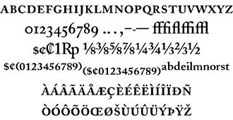
Currently, Expert fonts are limited to
those fonts which are the most popular type faces. These fonts contain special
characters such as `ligatures', `small caps' and `swash' letters that are not
normally used, or needed, in the everyday world of commercial typesetting. For
certain classes of bookwork and high-class typesetting purposes, their
inclusion forms an invaluable addition to the finished result.
Expert Font

Swash Font

Alternate Character Font

Swash Character Font
It is unfortunate that in many cases, the actual number of
characters that typefounderies include into some of their expert fonts is
small, necessitating the purchase of additional fonts to service particular
typesetting needs.
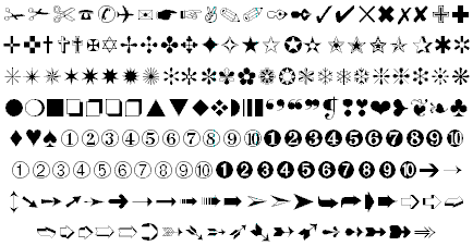
Pi fonts usually contain a collection of special characters such as mathematical,
monetary or decorative symbols, etc.

Pi Font � Zapf Dingbats
If you have a special need for certain
characters, most manufacturers will make a pi font to fit your need using
standard characters or even develop new one to suit you. Symbol, Carta,
and Zapf Dingbats are examples of common pi fonts.
Family
The last variable in the flexibility (and popularity) of a type face design is
whether or not the design has a range of variants. If a number of fonts have
the same name and general characteristics of face, e.g. Times Roman, Times
Bold, Times Roman Italic, etc. then they are known as a Family.

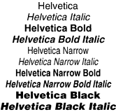
Font Family
The majority of fonts in common use have at least four
variants, i.e. normal, italic, bold, and bold italic. The popular type design
used above (Helvetica), has a family of over 50 variants, whereas many
decorative and script style fonts such as Algerian, Arnold Boecklin Giddyup and
Pepita, do not have a range of different variations and are usually restricted
to a single font.
When nominating a type face, the order of description can be thus:
Type Size: 10 point
Type Body: 12 point
Type Family: Helvetica
Type Weight: Bold
Type Width: Extended
Type Modification: Outline
Type Posture: Italic
Type Face Terms Explained (Part 1) |
Type Face Terms Explained (Part 2)
|