Page Hierarchy
Understand the medium
Readers experience Web pages in two ways: as a direct medium where pages are
read online, and as a delivery medium to access information that is later
downloaded into text files or printed onto paper. Your expectations about how
readers will typically use your site should govern your design decisions.
Documents to be read online must be concise, with the amount of graphics
carefully "tuned" to the bandwidth available to the mainstream of
your audience. But don't patronize your readers or insult their intelligence.
The common advice that the Web is dominated by semi-literate
"screenagers" who won't read more than two sentences in a row is
grossly exaggerated, and probably irrelevant to you and your audience anyway.
You do not need to "dumb down" your content or shave it to a
meaningless skeleton. Just be aware that readers will typically want to print
longer pages or more complex presentations to read "offline" from
paper.
Establish a visual hierarchy
The primary task of graphic design is to create a strong, consistent visual
hierarchy, where important elements are emphasized, and content is organized
logically and predictably.
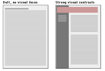
Graphic design is visual information management using the tools of layout, typography,
and illustration to lead the reader's eye through the page. Readers see pages
first as large masses of shape and color (see below), with foreground elements
contrasted against the background field. Only secondarily to they begin to pick
out specific information, first from graphics if they are present, and only
afterward do they start parsing the "harder" medium of text and begin
to read individual words and phrases:

Thus the overall graphic balance and
organization of the page is crucial to drawing the reader into your content. A
dull page of solid text will repel the eye as a mass of undifferentiated gray,
but a page dominated by poorly designed or overly bold graphics or type will
also repel sophisticated users looking for substantive content. What you want
is an appropriate balance that attracts the eye with visual contrast:
Proportion and "appropriateness" are
the keys to successful design decisions, but those things can only be
determined within the context of your overall purpose in developing a Web site,
by the nature of your content, and most importantly, by the expectations of
your audience.
Direct the reader's eye
In the West readers of English read from left to right, and from the top of the
page to the bottom. This fundamental visual axis dominates most design
decisions, and is the basis for most conventional graphic design of print
publications. In page layout the top of the page is always the most dominant
location, but on Web pages the upper page is especially important, because the
top four inches of the page is all that is visible on the typical 14 to 16 inch
office computer monitor.
Subtle pastel shades of colors typically found in nature make the best choices for
background or minor elements, especially if you are new to graphic design and
color selection. Avoid bold, highly saturated primary colors except in regions
of maximum emphasis, and even there use them cautiously. Type must always
contrast sharply with any background color. If you have a dramatic or complex
graphic scheme in mind, hire a professional graphic designer to execute it. If
you are not a designer and must do things yourself, keep everything
conservative, conventional, and simple.
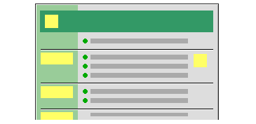
Graphic distractions
Beware of graphic embellishments. Horizontal rules, graphic bullets, icons, and
other visual markers have their occasional uses, but apply each sparingly (if
at all) to avoid a patchy and confusing layout. The same applies for the larger
sizes of type on Web pages. One reason professional graphic designers are so
impatient with HTML is the grotesquely large type sizes displayed by most Web
browsers when using the "H1" and "H2" header tags. The
tools of graphic emphasis are powerful, and should be used only in small doses
for maximum effect. Overuse of graphic emphasis leads to a "clown's
pants" effect where everything is garish and nothing is really emphasized:
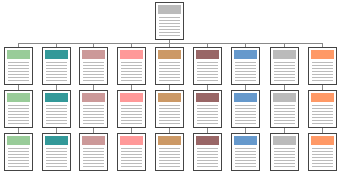
Be consistent
Establish a layout grid and a style for handling your text and graphics, then
stick with it to build a consistent rhythm and unity across all the pages of
your site. Repetition is not boring; it gives your site a consistent graphic
identity that reinforces a distinct sense of "place," and that makes
your site more memorable. A consistent approach to layout and navigation allows
readers to quickly adapt to your design, and to confidently predict the
location of information and navigation controls across the pages of your site.
If you choose a graphic theme, use it throughout
your site. Metadesign's home page banner (below) sets the graphic theme for the
site, and introduces distinctive typography and a set of navigation icons:

Graphic has been reduced from the original size. www.metadesign.com/
This is a banner at the top of an interior page in Metadesign's site. Note how
the typography and icon theme is carried through to all interior banners. There
is no confusion about whose site you are navigating through:

Graphic has been reduced from the original size. www.metadesign.com/
"Style"
Don't set out to develop a "style" for your site, and be very careful
about simply importing the graphic elements of another Web site or print
publication to "decorate" your pages. The graphic and editorial style
of your Web site should evolve as a natural consequence of consistent and
appropriate handling of your content and page layout.
References
Hurlburt, A. 1977. Layout: The design of the printed page. New York: Watson-Guptill.
Meggs, P. B. 1989. Type and image: The language of graphic design. New York: Van Nostrand Reinhold.
Mok, C. 1996. Designing business: multiple media, multiple disciplines. San Jose: Adobe Press.
Spiekermann, E., and E. M. Ginger. 1993. Stop stealing sheep & find out how type works. Mountain View, CA: Adobe Press.
Tufte, E. R. 1990. Envisioning information. Cheshire, CT: Graphics Press.
White, J. V. 1988. Graphic design for the electronic age. New York: Watson-Guptil.
Wilson, A. 1974. The design of books. Salt Lake City: Peregrine Smith, Inc.
|